|
|
|
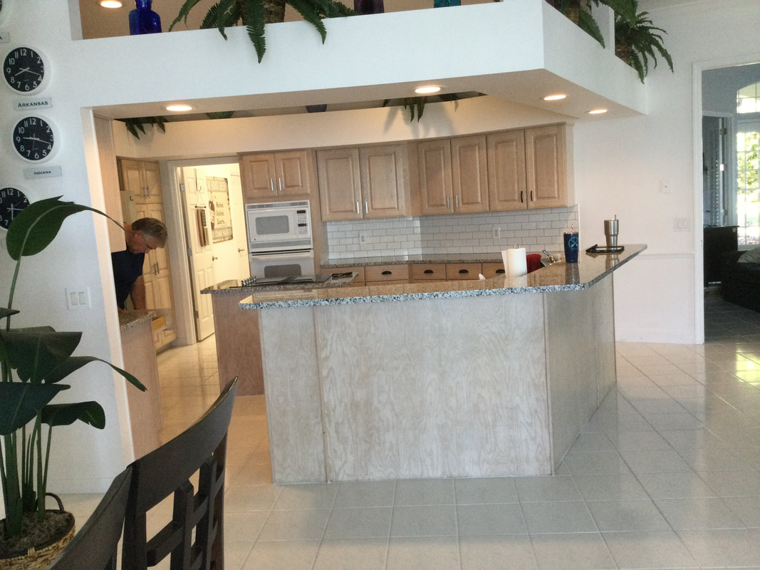
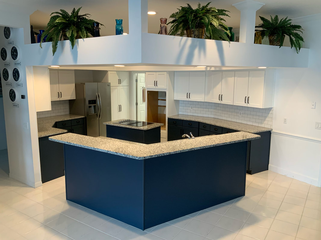
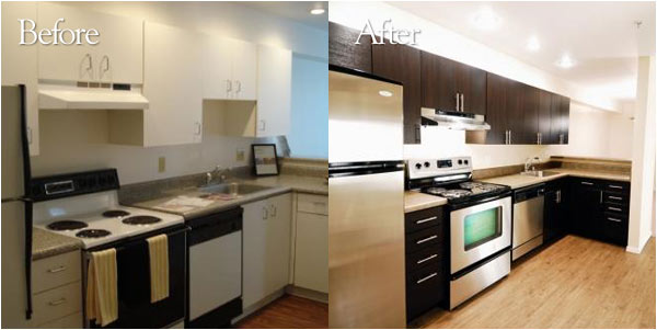
We recently had a customer out in Winter Haven who needed their kitchen remodeled. This job was then promptly introduced to a local installer who orders their doors from one of Dackor's local press customers in Florida. The cabinetry needed to be laminated to a cream white color to match the walls. They had an island and lower cabinets that needed to be laminated in a navy blue color to match the aesthetic. Not to mention, there were many different new kitchen appliance installations that would affect the laminate application process. When all was said and done however, the results were night and day! The Perfect Touch Snow White cabinetry matched the walls of the house nicely to maintain a clean look. The Perfect Touch Mysterious color on the island and lower cabinets complimented the aesthetic of the kitchen nicely in a way that didn't take away from the granite countertops. And all of this was done seamlessly to make room for a whole new set of appliances to compliment the fresh new look. Let us know what you think ! Perfect Touch Royal Blue
$0.50
ID: S075 - View Larger Image Specs: 0.35mm x 1420mm, Super Matte Finish *Click "Add to cart" to order a sample swatch
39 Comments
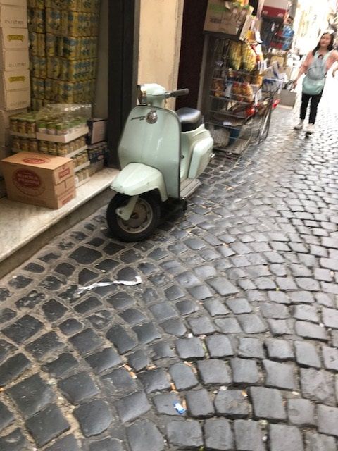
(THIS ARTICLE WAS PUBLISHED by SURFACE & PANEL magazine Q2, 2008; www.surfaceandpanel.com) Whether you refer to it as thermofoil, foil, PVC Veneer, 3D Laminate or Vinyl, one thing can be certain: there is an identity crisis regarding our product here in North America. As with marketing any product, it is not only important that people know what your product does, but that they also have a positive impression about it and the product segment that it resides in; as a result, the quality and reputation of your product segment as a whole is ever bit as important as your company and brand. Since there are numerous names for our product segment, it is very difficult to explain to outsiders what our product is. I’ve even met cabinet makers and specifiers, much less people in typical social settings, who didn’t know what product I meant when I said “thermofoil”. I’d have to explain that it’s the same material used for “white vinyl wrapped doors”; even at that, though, they didn’t know that those same 3D laminates were available in wood grains! If I said that I sell granite, they would all clearly identify and usually have a positive reaction about that product segment; however if you take a look at our product segment, we lack all of that. When you think about it, though, how could a product segment that lacks a single, clearly identifiable name build awareness as an industry? I have long thought that there should be one clear name to identify our product segment. In 1998, I started using the phrase “3D Laminate”. I can’t be certain that I was the first to use it, but I certainly had never seen it used previously. The year prior I had noticed at the NeoCon office furniture show that people would ask how our product was used. In response, knowing that most people clearly understood what an HPL chip looked like, I created a professional board that was backlit and spread chips out in front that were cut to represent the size and look of HPL chips. I used the term “3D Laminates” on top of the board. At that show I received many comments that, “Wow, they have 3D laminates now?” I realized then that the more descriptive name of “3D Laminate” helped to identify our product segment while also adding value over a traditional laminate. Aside from a more descriptive name, our product segment lacks a positive image. Cabinetmakers and consumers alike do not recognize the quality and high end application potential that 3D laminates can offer. In Europe, 3D laminates are viewed as a durable, hygienic and a fashionable surface. It is not only more economical than wood, but it is also more consistent and offers a great deal more color and design options. If a project called for an exotic West African wood, the cabinet door could cost as much as $50 per square foot; however, a 3D laminate door in that same design and application would cost only a fraction of the price. In addition, a quality 3D laminate would be more consistent in design, and no “Old Growth” forest would need to be touched. Although 3D laminate doors are typically produced using PVC as an overlay, the bulk of the finished product is made by MDF. MDF is composed of blended raw wood material utilizing low priority wood composites of branches, small diameter trees, mill waste and forestry chips. It could be argued that our product segment even deserves recognition in the revitalized green movement. In Europe, why are 3D laminates perceived as fashionable and modern surfaces to be used in mainstream and high end applications, but not here in North America? In North America, we typically see 3D Laminates as a lower end product used only in the bathroom, for apartments or in the closet. One problem is that, unlike their larger European counterparts, the extremely large kitchen producers here do not promote 3D laminates as a consumer friendly product and product of desire. At the opposite end of the scale, the small custom shop, which got its start as a custom wood craftsman, is pro natural wood, especially since “real wood” has a tendency to be viewed as a product that a cabinet shop without an automated CNC can roll up their sleeves and work with by hand. So without the large kitchen producers and small cabinet shops pushing 3D laminates, what remains is only a small niche of kitchen and component producers who specify and utilize the product segment. The exact numbers are hard to pinpoint, but it has been reported that over 55% of kitchens in Europe use 3D laminates, whereas in North America that number is less than 10%. Typically, when you do see 3D laminates in North America, they are marketed as a type of counterfeit wood door. Mostly, though, they are promoted as multi-pass raised panel doors which require more CNC time than a slab door, thus warranting a higher price than a single pass routered door. It’s also interesting to note that the perceived value of a kitchen in Europe is created by the color or design, whereas in North America the perceived value is more closely associated with how long it takes to produce. We have all heard the adage, “You sell what you show.” Well, in North America, the marketing efforts of 3D laminate door producers have collectively leaned towards selling their product as counterfeit, raised panel wood doors, which by their very nature is lower end on the pricing scale; as a result, thermofoil has become synonymous with low end. As an Industry, shouldn’t we be promoting our 3D Laminate components to the High End design market? I feel that we should. The reason that 3D Laminates are not being offered to the high end clientele currently is a direct result of a category identity problem, which derives from a lack of information and education about our product segment as a whole. As I mentioned, 3D Laminates are more popular in Europe, but let’s further examine why. First of all, the European market has a greater concentration of large manufacturers whom value consistency in their production line. These larger manufacturers create brochures that rival the automotive industy’s in style and quality and they proudly promote Kitchens that utilize 3D Laminates. Wood is also more scarce in supply and comes at a higher cost, and the average labor rate is high in most European countries. As a result of all of this, the large manufacturers are compelled to better utilize their machinery and material, such as 3D laminates, to add the most value possible to their finished product. Consequently, the 3D laminate product segment is perceived as a high end, high quality product in the European kitchen market. (On a side note, the consumers in Europe also live in tighter spaces; therefore “Euro Style” or “Full Access” cabinetry lends itself to being more desirable since more of the cabinet is usable.) Now let’s compare the European situation to that in North America. In North America, “real wood” cabinet doors are viewed to be higher quality than 3D laminates. It is interesting that some of these “real wood” kitchens use the low-end wood doors, cheap hardware, untreated paper on the cabinet sides, and low-grade particle board. Then these kitchens are sold as being a high quality kitchen simply because they utilize “real wood” doors. Compare that kitchen to a Euro Style kitchen produced here in the US using a CNC with an all melamine board construction and Blum hardware; I would contend that the US made Euro Style kitchen offers more quality and value than the former. That is not to say that 3D laminates are superior to wood, but at the same time they are not necessarily lower in quality either. Allow me to give some examples of where man made products can outperform or have a higher perceived value over the “real” surface: “Real” but LOW END PRODUCTUses Natural Wood, Leather, Steel “Man Made” but HIGH END Uses Graphite, Plastic or Fiber Wooden Golf Clubs VS. Callaway Graphite Clubs Leather Shoes at Wal mart VS. Nike Running Shoes Leather Handbag from Mall VS. Gucci Designer Handbag Butcher Block Island VS. Corian Solid Surface by Dupont Steel Ford Pinto VS. Fiberglass Corvette Steel Bike from Target VS. Carbon fiber Racing Bike Low end Maple Cabinets VS. High End 3D Laminate Kitchen The above examples show that a man made product with artificial surfacing can be of a higher quality or of a higher perceived quality when properly produced, designed and marketed. If you sell your product based upon the wood species or how many passes it takes on the router, then you are not branding your product to its full potential. Let me give an example: Two years ago I visited the showroom of an Italian kitchen producer here in Florida, and was very impressed by the size and appearance, as well as the beautiful kitchens on display in large, wide-open spaces... It was obviously a very upscale showroom. I was admiring one of the Kitchens when an attractive saleswoman walked over and asked how I liked the kitchen. I remarked that it was indeed beautiful, and asked whether it was thermofoil. She began to explain to me that it was a special lacquer dipped process they do in Italy, but after hearing this, the showroom manager quickly walked over and corrected the sales person. They did have a special lacquer line, but it was for special order only. As it turns out, the kitchen I was looking at was indeed thermofoil. When I asked how much it retailed for, I was surprised at the high price level. In general, the average retail for their kitchens was considerably higher than the average “real wood” kitchen, but it did have a lot more hardware, function, high quality melamine construction and most importantly style.The Sales Manager and I ended up speaking for hours about the Kitchen Industry, the US market and the perception of foils in the market. I then realized that some of these kitchens coming in from Europe were sold widely into condos, as well as high end homes. When I have mentioned to designers the names of some high end kitchen producers from Germany and Italy, they drool over the thought of specifying them into their next project. They are viewed as an ultra luxury product, yet they don’t know or don’t want to see that they are using products that can be sourced in North America as well. After leaving that showroom, and after multiple trips to Germany and Italy, I have realized my calling. Although I didn’t hear a trumpet sound, I knew that it was my job to bring design and profitability to producers of 3D laminate components and kitchens to North America. I hope that this article reaches those who are in a position in their daily activities to join me in spreading the awareness of 3D laminates for use in high end kitchens. Last month I visited Milan's Furniture fair called Salone del Mobile. As always, its a big inspiration to see furniture but I've noticed in my travels around the world that I'm much more inspired by the sights and smells of street food, old architecture and natural surfaces. Design and Color is more than a job or some fantastical name we can throw out sitting at our desks. The names we select come from our memories and tell stories that not only bring a smile to our faces but also inspire future travels. Dolphins from the Fijian Islands inspire the name High Gloss Dolphin Gray and as you'll see below, Pompeii is inspiring new stone colors that are coming your way. 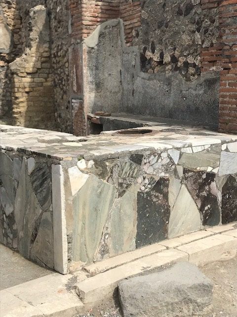 To the left is a Kitchen in Pompeii. Pompeii was a city destroyed by the Volcano Vesuvius in the year 79. For over a thousand years this ancient city remained buried and hidden under many feet of ash. This image has inspired the DACKOR colors Pompeii Ash and Pompeii Cream which are new stone designs that will soon be released. When you specify colors and textures by Dackor do they spark your imagination? If so, leave us a comment below and let us know your favorite color and I'll send you a message telling you the adventure that drove that color name.
We are... where designs form. Retailers have faced a mounting challenge since the massive success of Amazon has cut in-store sales dramatically. It has led many at the top of national chains to assess the way they are doing business. One area in particular that must be addressed to keep customers coming back is store design and decor. You can imagine that putting money into something that isn’t immediately affecting the bottom line is a tough pill to swallow, so in most cases that I have seen, maintaining a reasonable budget is very important. However, the last thing retail chains want is something that is cheap and won’t last. They want sustainable, durable, and cost effective. To decide where to go with this decision, it is first important to understand where we’ve been with interior décor in retail in general. Keeping in theme with needing a value-engineered solution, retailers have been shying away from real stones, leathers, and woods for years. The solution, as it seemed, was high pressure laminate (HPL). The designs offered by HPL were (and are) plentiful. They offered a look that simulated the real thing, but at a fraction of the cost. The scratch resistance was great. All seemed well, until the first customer came down the aisle haphazardly, with their kid tugging on their arm to request a trip to the toy section. And then, bam! It hit it exactly in the right place on the seam. That cart ran right into the brand new fixture that was designed to save money and look great. But now, the fixture was chipped, cracked, not looking quite as new. But, it’ll pass for now. Fast forward a year and take a look at that and all of the other fixtures that have been abused to the point of damaging the brand every time customers see it. Couple that with all of the fixtures that are just too badly beaten to even be seen in the store. They are lined up in the spare warehouse that used to be the garden center before that idea didn’t work out. There in an empty warehouse, lies thousands of dollars in investments, waiting for another several hundred dollar truck ride back to wherever they came from for preparation to sell to the highest bidder and be put into some lower end stores, or bought by a refurbisher and resold. How could have this been prevented? If only that laminate wasn’t so rigid. If only there was no seam. In comes 3D laminate; it’s a more pliable laminate that can be formed around a smooth wooden core (in most cases, MDF) to eliminate the seam and dramatically improve impact resistance. What’s more, the wide array of design options remains. The texture options are more plentiful. The price point is the same. The amount of impact that would have cracked and chipped that old HPL fixture now only dents the fixture, at best. So, how does one find this type of fixture? Can my normal fixture manufacturer use your material? In order to take advantage of the ability to go seamless, you just need to find a manufacturer with a vacuum or membrane press. In the U.S. alone, there are over 200 manufacturers with this potential. The material can also be applied to any flat surface to give you the impact resistance you desire on the face of the shelf or fixture; or, it can even be flat-laminated and miter-folded over the edge to eliminate the seam. This means, that most manufacturers can use a 3D laminate in such a way that will make your fixtures more protected from impact resistance. If you would like more information on 3D laminate specification, designs trending in your market, or for technical data, feel free to reach out to me at 407-654-5013 Wall covering news:
Dackor has launched Accent Planks which are an ideal product for wall decoration. These planks decorate Accent Walls for an upscale look. The options vary from the wood-look , Stone and leathers. The Accent Planks standard size for woodgrains and hand painted white are 6" x 48" whereas the Accent Planks XL for "extra large" are 24" X 48" since the larger format of leathers and stones look better in a larger size. Due to these panels light weight there are no issues in the panel size. Accent Planks are made by Dackor in their Orlando based production facility utilizing their rigid 3D Laminates via a hot fused lamination technique to expanded PVC foam and the entire back utilizes an acrylic based peel and stick material rather than the strips used commonly in the plank market. The 6" wide planks come 16 square feet to a box whereas the XL planks come 32 square feet to a box. To install the planks, you simply peel and stick with no need for grout, sealers or saws. To cut you simply score with a utility knife and pop the plank to its desired length. The benefit of this unique wall covering is its ease of install, simple and unique look and lower cost. Dackor supplies renowed sculptured wall plank producers such as Interlam, Vertical Illusions, Lumicor, Soelberg Industries and 3form. Dackor highly recommends these companies due to the unique dimensional look that can only be achieved by these manufacturers. The Accent Planks are simply a more affordable wall covering that is meant to compete more with tile and fabrics. The look of these Accent Planks are actually created by our selected series of designs which are textured to give a luxury look and since the planks have defined shapes the outline of the planks themselves give the desired finished look. Dackor expects that the most popular items will be the leather series such as the black and white alligator as well as the stone series, especially the Sahara Stone concrete prints in 24" x 48" panels. The company will be launching a new website to support the sampling and ordering at www.accentplanks.com Previously I wrote an article which was subsequently published by Surfaces & Panel magazine entitled: 3D Laminate Thermofoils are ideal for High End Kitchens http://thermoformingtimes.blogspot.com/2008/03/thermofoil-is-ideal-for-high-end.html Earlier this year I decided to remodel my Kitchen and of course I used our product. Although this is certainly not the first Kitchen to utilize an affordable 3D Laminate in a high end Kitchen, each project is unique. I think that marrying kitchen design with the specialized knowledge of 3DL is key. kitchen specs: DACKOR Legno Wenge drawers: Match to Arauco Libretti DACKOR Stone Grey- custom color upper doors Miele Speed Oven H4084BM Miele Convection Steam Oven DGC4084XL Miele 30" Induction KM5753 Miele 36" Hood DA 3490 Miele Dishwasher G5225SC Subzero Refrigerator IT-36CIID Everpure Water Chiller EV931830 Everpure Water Filter H140 Miele Dishwasher G5225SC Pompeii Quartz Counters , Color Milky Way Hafele Ribbon Strip lighting for under cabinet Blum Soft Close and Blum Tandem Stainless boxes Solid Plywood boxes with white melamine overlay Higher upper cabinets for mirror install It should also be noted that the fridge gables were manufactured by mitre folding of our laminate however on the light valances, DACKOR Stone Grey peel and stick was used. Dackor, produces and sells this peel and stick directly to Membrane Press or Vacuum Press companies or via thepeelandstickstore.com.
My experience with this Kitchen gave me some unique perspectives. I was able to learn how truly difficult Kitchen design can be, I learned a lot about how high end European appliances require special considerations, about how peel and stick can be used on the job site for specific uses such as light valances, fillers and even fridge gables. The Subzero Freezer drawer. Notice the 1" Fridge gables and how they frame out the fridge. With over 150 stock colors, I really was perplexed as to which color I'd use in my own personal Kitchen. I knew that I'd be investing most into appliances and that they would cost more than the boxes and doors since I'm (In the industry). I ultimately chose our Legno Wenge which is a stock design and our Stone Grey which is a stock transfer from German Stock. The unique thing about this Legno Wenge is that it has hints of grey inside as well as taupe. All of the walls in the house were Benjamin Moore Mineral Ice 2132-70 and most of the floors are travertine and Brazilian cherry. I'd like to give special thanks to Reid Pasternack. http://www.reidpasternack.com He was the interior designer of the house interior and was instrumental in the color scheme and layout. Chris Buffington was key in the cabinet box sizing, light valance and really made the Kitchen production possible. And finally Zsolt Lovas, originally of Austria and now an Orlando based Cabinet installer did an outstanding job. Hopefully more people will share their High End Kitchens that utilized 3D Laminates. If you have a project that used Dackor 3D Laminates and would like to share your project please email me. 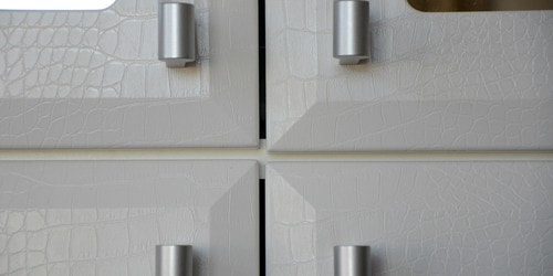 REPOST: Project Using Dackor Leather White Alligator This project is specifically complimentary because Jill Zarin's family owns Zarin Fabrics. Certainly Jill has an eye for high end materials and it was a huge compliment that she selected our White Alligator via the Closet Factory. Jill Zarin Custom Closet StoryBy:Gabi Glassman Reality Star Jill Zarin pictured in front of her shoe closet. Being a designer for Closet Factory is always satisfying and fulfilling. I truly enjoy creating beautiful spaces that help people organize their lives. This fall I had the opportunity to work with an amazing client, Jill Zarin ! She is a former Real Housewife of New York (Bravo TV), best selling author of Secrets of a Jewish Mother, the creator of the shapewear line SKWEEZ COUTURE and now also Jill Zarin Bedding; not to mention trendsetter, fashionista; The mom of Ginger (New York’s most famous dog) and just recently tennis partner of Chris Everett in a charity event. How exciting! Working with Jill was so much fun! Her energy and enthusiasm made the whole process from design to installation extremely rewarding. Closet Factory Designer Gabi Glassman Werner pictured with Rocky one of the New York location's Installers.The challenge was creating a glamorous closet that would coincide with the decor of her chic Manhattan apartment while exceeding all of her wardrobe storage needs.Her apartment is beautifully appointed with silk fabrics, hand painted walls, beautiful carpets, custom wood built-ins with a mix of art deco pieces and antiques. The color scheme was blues, teals and grays…. There were sweeping views of the East River from every room. We decided to select a new color, Linen Light Gray Melamine, for the closet with hardware accents of large modern handles in brushed chrome. The Linen Light Gray was selected for it’s texture and color because it complimented the hand glazed walls and grey silk carpet. DACKOR's White Alligator doors with Mirrored inserts and Crystal Bar Handles was selected for the wall unit in the bedroom. It was dazzling and fit the room perfectly! Now that the decorating decisions were made we needed to address the storage problems. Jill’s current custom closet system designed by another closet company was not working for her. It consisted of a closet organizer designed with basic shelving, hanging rods at standard heights and a few deep drawers. Her large selection of designer handbags and shoes did not fit into the space. Her leggings and T-Shirts were in such deep drawers she could not find what she needed without going through the whole drawer multiple times. Because her rods were hung all at the same height it did not accommodate the variety of dresses that she owns. Almost all had a different hemline from short to long. And there was a major flaw in the current system – there was no place to store Jill’s costume jewelry and even worse her Skweez Couture line. With some creativity and careful sorting of dress lengths the new design we can up with incorporated all of Jill’s needs. In Jill’s new design the closet had a tower of velvet lined 3″ high Lucite trays for her leggings and Skweez Couture. Because the fronts were clear she could see exactly what was inside each tray. The shallow depth of the trays made it easy for Jill to find what she needed without digging or searching as she had prior. We used lots of deep shelves to house her handbags and installed a variety of hooks on the wall behind the door for additional handbags that worked well hanging from their straps. We custom hung her rods at different heights to accommodate the different lengths of dressed she owns. Drawers for T-Shirts and sweaters were placed as a focal point on the back wall as well as a double-decker jewelry drawer with a lock. Because the ceiling height of the closet was 9 feet tall we were able to use all the height to create optimum storage. The Faux White Alligator wall unit with Mirrored inserts contains storage for Jill’s current selection of designer shoes. There is space for tall boots as well as Lucite slanted shoe shelves for the rest of her shoes. Close up of DACKOR's White Alligator Faces detail designed for Jill Zarin's Wall Unit. Now Jill is very happy with her Closet Factory custom closets. They exceeded her expectations in storage, organization and appearance. She is so happy that she asked me to design her husband Bobby’s Closet!!! 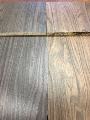 Tafisa Tanner's Lane & Smithy Street are in Dackor is pleased to announce yet two more 3D Originals. Recently we purchased the PVC rights from the paper company and invested in the Origen Emboss to make outstanding matches to Tafisa's Tanners Lane L561 and Smithy Street L560. Sample rolls are ready and we have a small quantity in stock with the full production run expected in several weeks. Be the first one to show these matches to your customer by contacting us! Coming before year end will be the two new items to Tafisa: RiverRock L538 and Breakwater L537 See our cross reference for a full list of our 150 plus stock items ! Solid Color Explosion Dackor now has in stock over 50 Solid Colors... See them all here at our newly designed website. Super Low : 600 Yard minimum As you may know, Dackor offers a 600 yard minimum for new color development. We produce a full production run of 2000/3000 yards however you are only obligated to take 600 yards. We maintain stock thereafter. Contact Sales to learn more about custom color capability. Many manufactures , cabinet shops, sign shops, handymen, and installers use high pressure laminate from brands such as Formica or Wilsonart. Although these laminates are great they are rigid and may require a table saw and router. On site fabrication can be dusty, noisy and have the smell of glue.
Dackor manufactures a product called Peelstix. Peelstix is a flexible laminate that can be trimmed with knives and can be fabricated in a shop or on site with no dust or smells. By having the adhesive already on the product it can also save time. Peel and stick laminate is used for cabinet refacing for single family homes, DIY, apartment remodels, and adult living facilities. Other applications are items such as office desktops, particians, walls, columns, cabinet faces, metal, ceilings, glass, on drywall, on plywood, check outs, healthcare, and many more. With over 150 stock colors and a 9 foot minimum order doing business with them is an ease. In addition, they offer a school, installation manual and guidance. You can visit them at www.dackor.com or www.refacesupplies.com or by calling DACKOR at 407-654-5013 Introduction
As a manufacturer of 3DL Doors or components you are probably used to seeing color matches of solids and woodgrains. On occasion you may have even had a manufacturer to color match some item for you. In this article I will delve into the technical side as it relates to color matching and color control. I will explain more about why different sources of light affect the color and cause metamerism and I’ll mention a lot of interesting facts such as how the size of a sample can actually change your perception of the color. Since most people selling doors, components or Kitchens utilizing 3D Laminate thermofoils are selling color I think that there may be new and interesting facts as it pertains to colors. Appearance There are three things that have the biggest impact in matching a 3D Laminate; the print, the texture and the gloss level. One interesting point is that under normal viewing conditions a sample with a higher gloss level will generally appear darker than a sample with a matte surface. This means that when matching colors it is critical to not only match the design but the gloss level needs to be similar. It also means that if you are working with two different products such as a melamine board and a 3D Laminate which has a different texture you will need to make some consideration in regards to how the different textures are contributing to the color. When I visit a customer or when I am managing our sales staff I ask questions such as : 1. Who is the decision maker? Purchasing, Management or their client? 2. Does the decision maker have a window in their office and to which side is the window facing their desk? 3. Does the decision maker have flourscent lights or incandescent? 4. Does the decision maker hold the samples up in front of their face or look at them laying on their desk? 5. Does the client want ticking texture or a different texture than the target color? The above questions are critical to being a good color matcher because all of these small things play into the quality of the match as I’ll describe below. Texture The surface texture will dramatically change the gloss level and affect the perceived color. An interesting pont is that the human eye is more critical of any color difference in a smooth texture than in a rough texture. So if a customer asks us for a smooth emboss on a solid color then it means that the accuracy will be more fragile. When matches are made to HPL (High Pressure Laminate) or TFM (Thermofused Melamine) typically there are various things that cause the materials to look differently. Firstly the process of impregnating papers with melamine resins can create a bit of a haze. Secondly the texture used on the press plates is often different that the embossing rollers used in a 3DL (3D Laminate). This affect is called metamerism. There are various definitions of metamerism however I feel the most accurate for our purpose is: “a metamerism occurs when the color standard and the submit do not match under all lighting conditions. This means that a solid color fabric when viewed under two different lights in a commercial light box, will appear to cast two different colors.” Texture is the biggest refractor of light and this is the key source of metamerism. So the key point here is that the target match (paint, TFM, or HPL) typically is different than the surface texture of the 3DL so the match complication is dramatically increased. So for any manufacturer of steel, laminate, paint, carpet or whatever surface manufacturer, the difference in processes between manufacturers is a key complication in color matches. Color – The Fundamentals Since 3D Laminates are a plastic for you to better understand colorants it first requires basic knowledge of how color works for plastics. Color is not an absolute property as the perceived color of an object is dependent upon three elements. The elements are Illuminate, Observer and Object. Illuminant The illuminant used will affect the perceived color dramatically. Perception of color is unique as the human eye perceives colors differently under various light sources. The perceived color under a fluorescent light is different than that perceived under an incandescent light, and they will both be different to that perceived in daylight. Keep in mind that daylight is one of the most uncontrolled and variable sources of light, and will vary with time of day, weather, orientation, etc. Observer Perception of color requires an observer (either human or instrumental). What most people are unaware of is that every individual has a unique and different sensitivity to color that may be biased slightly towards a specific color. So they may be unaware that they believe a color is a good or poor match however the general population may in fact that it is a good match. This does not mean that they will always get it wrong but it can mean that as an individual you may perceive maples or yellow toned colors inaccurately however for cherries or solid whites your eye is highly accurate (based upon the populace). An interesting fact is that Men are approximately 16 times more likely to be color deficient than women. Approximately 8% of men and 0.5% of women have some degree of inherited color deficiency (200 million people worldwide). Red-green color deficiency is a hereditary disease, carried by the X chromosome of females. For this reason the daughter of a color deficient father can pass it to her sons. Women have two X-chromosomes and one defective X chromosome will be compensated for by the other non-defective. The chances of having two defective X-chromosomes are small. Aside from men being 16 more times likely to be color blind, researchers have also found that there are in fact differences between men’s eyes and female’s eyses. As you may know humans have 3 different type of cone cells in our eye. Our eyes perceive color basically the opposite of a TV set. On a TV there are different color dots of red, green and blue. In the eye, con cells also have three different photo pigments that are generalized as red, green and blue but actually they are yellowish green, green and bluish violet. What researchers have discovered was that over 50% of all women posess a fourth photo pigment that makes women more adept at detecting subtle spots of red light. So in conclusion, women (on average) are superior at more accurately detecting colors. Object Most are unaware that the target or object may appear to be relatively constant but in actuality the color perception can vary within an object. So large areas of a color appear brighter than small areas of a color. If a target is a solid white HPL that is 2 square feet the absorption of light will affect the perception to make the sample appear lighter than if a 3” X 4” color sample is used. That is why factories who produce color maintain internally strict color matching procedures such as the size of samples they are evaluating. This is called (the area effect). The next time you show a client your color match try to present samples of the same size so the customer can more accurately perceive the colors. Colors will actually appear duller when in front of a bright background than when in front of a dark background. This is called (the contrast effect) The next is that colors will appear different when viewed from different angles or when illuminated from different angles. This is called (the directional effect). So image when a sales person presents a color match to a client and the light source is above head whereas another client may have a lamp on his desk or be sitting by a window. Imagine how all of these can affect a client’s perception of the quality of match. Measuring color Color measurement can be carried out either by what is called a human colorist or by instrumental means. Using a human provides exceptional differentiation between colors but is limited in how this information can be transmitted to others and used as a control mechanism. Instruments sacrifice some color differentiation, but have the advantage in that they are reproducible every time. Instruments map onto a “color space” to provide the numbers or symbols for comparison and specification. Hue Hue is the basic color and is generally divided into a color wheel which ranges through 5 principals that include (red, yellow, green, blue, and purple) and all the variations in between. A simple color wheel is shown below. The location of a color around the wheel obviously defines the ‘hue’ of the color. Lightness (brightness or value) Lightness is the vertical axis and runs from light at the top to dark at the bottom. The location of a color on the lightness scale defines how light or dark the color will be. Saturation (chroma) The saturation of a color is how far away from the light axis it is – colors which are far away from the value axis are pure colors and those close to the value axis tend to be grayer. Saturation defines how pure a color is. Various color measurement systems have been developed in order to locate the 3D space. The very first system was the Munsell system developed by American artist Albert Munsell and this is known as “the rational way”. They use indicators such as 7.5PBYR 6/6. This indicates a purble blue hue but closer to purple with lightness of value 6 , a saturation of 6. This is a pure visual eval system. The next is the CIE (International Commission on Illumination) of the Yxy color space, the L*a*b* color by CIELAB and the Hunter Lab color space. In the L*a*b* system which is typically used by 3D Laminate manufacturers to color control colors it uses the following: L* defines the lightness/darkness of the color. a* defines the greenness/redness of the color. b* defines the yellowness/blueness of the color. The combination of L*, a* and b* can be used to define the relationship between colors and as a quality control tool by most laminate manufacturers.Please note that “E” is the average of L, a and b so it is common to have the E number listed as well. Color measuring instruments The two most common types of machines for the measurement of color are the tristimulus colorimeter and the spectrophotometer. The tristimulus colorimeter is a machine that directly measures the sample color and uses red, blue, and green receptors. This is simliar to the human eye. The major disadvantage with this type of machine is that the results are only meaningful under the specific illuminant used for the machine. Different colorants respond to different lights in different ways (a phenomenon known as metamerism as mentioned earlier in this report) The spectrophotometer measures light across the whole of the visible spectrum to produce the full reflectance curve that can be processed to give the tristimulus values and chromaticity for any desired illumination. The full reflectance curve for various colors can be investigated to determine if metamerism will be present under varying illuminants. The use of spectrophotometers requires knowledge of the type of machine being used and the detailed geometry of the machine – the various types available can detect or exclude texture and gloss levels and even take into account special effect finishes such as mica or flake colorants. Measurement problems Metamerism: Color perception of many colorants is often affected by metamerism. This is where colors that may appear the same under one set of lighting conditions will appear different under a different set of lighting conditions. Typically in our industry metamorism takes place between fluorescent light sources and natural sun light since most manufacturers using the 3D Laminates do not have an International Standard Light box on premises. Temperature: Color is often ‘thermochromic’ and most colors will change with the temperature at which the measurement is made. Humidity: Color is often ‘hydrochromic’ and most colors will change with the humidity at which the measurement is made. Methods of Coloring Plastics 3D Laminates Plastics are typically colored by the following methods of printing, painting, pigments, internal colorants, dyes and surface colorants. For pratical purposes please note that the color of a 3D Laminate solid color is in the base calendered film whereas in a printed woodgrain the color is adjusted by the printing primarily using 1 to 5 print cylinders. This process is known as gravure printing where the print rollers (rotate) dip into an ink pan and rotate while applying the ink to the print layer. Printing can be done by direct to a print layer or via reverse printing to a clear transparent print layer. The average amount of printing cylinders is 3 and each cylinder must turn in register to one another in order to give the print clarity. The second way to adjust the color is through the base layer which can affect the darkness or lightless behind the print layer. Summary I hope that after reading this post you have picked up something new in regards to color, perception, procedure or that you have a better feeling for how humans interact with color. In some small way I hope that this article can influence how you sell color or how you may be more careful of conveying color to your client. Try to be observant of your customer’s light source, to the size of the sample and pay specific attention to the texture of the surfaces. As long as your X chromosome isn't defective and you follow the principles above you can have a better understanding of color and especially matching of colors. |
Design Life blogColor inspiration from around the world, backstories on design inspiration and informative articles about marketing, membrane pressing and personal development. Author Mark Viers delivers fresh content that will help you and your business grow and thrive. Categories
All
Popular articles Language of Color Breaking membranes? Delamination Tearing on corners Solving wrinkles Solving dog ears Video installing peelstix 3DL for high end kitchens Pompeii design inspiration Archives
May 2024
|

 RSS Feed